
As a follow-up from my previous post about Richard’s handwriting, I thought I might consider the writing of a few others of his time period. Please bear in mind again, that this is just for fun and I am not a professional handwriting analyst. Also, there are only a few examples of the handwriting of some of these people that I was able to find (if you have access to any others, please let me know).
Firstly, let us consider the writing of the King and Queen for most of Richard’s life: Edward IV and Elizabeth Woodville.

Here is Edward’s signature, when he was the Earl of March, so he must have been younger than eighteen. Just look at the lower zone, which represents physical material and sexual needs and appetites. Need I say more? OK, then! It contains parts of letters that have no business being in the lower zone, such as part of the M and r and h. This shows someone who is experimental when it comes to sex. The rounded part under the M is rounded and makes me wonder if he was a ‘boob’ man! The little ‘logo’ type thingy after the name puts me in mind of a musical stave, which might suggest a love of music. The signature is bold and clear, showing confidence and possibly arrogance and is upright which indicates someone who likes to be in control.
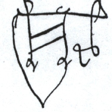
Written at the same time was the signature of Edmund of Rutland, Edward’s brother, who sadly was killed at the battle of Wakefield. This is his signature:

It is smaller and less confident than Edward’s, but the letters are well-formed and clear, especially the ‘a’, which is a communication letter. He would have been a clear communicator and could keep a confidence. His upper zone is exaggerated, showing that he was intelligent, but there is a superfluous upside-down ‘v’ on the top of the ‘l’, which looks like a little hat. Perhaps he enjoyed wearing hats – certainly the letter this is taken from mentions hats in particular!
…that we myght have summe fyne bonetts sende un to us…”
Written to the Duke of York, their father, at Ludlow
The Initial ‘E’ is raised a bit higher than the ‘Rutland’, and has some extra marks in front of it, which look a bit like a bow and arrow: I’m sure the boys were training in all kinds of weapos, bows/arrows included and would certainly have hunted with bows and arrows.
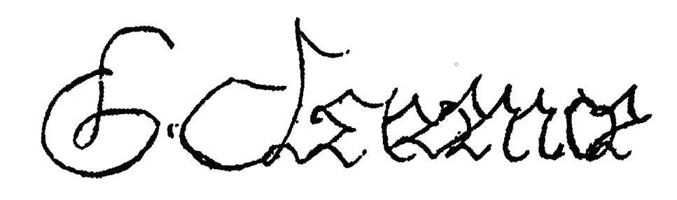
Here is one of Edward’s later signatures with a bit of other handwriting which I have been advised reads ‘votre (abbreviated) bon cousin’.

Anyway, you can see that his lower zone overlaps the line underneath, which shows his lack of keeping within the normal bounds when it comes to sex. However, the lower curl of the ‘y’s are not that well defined. I’m not sure how old he was when he wrote this, but his libido looks to be less than before. The slope of the writing is erratic, suggesting a mercurial nature and the communication letters are also erratic, some carefully rounded and closed and others open – a lot of the letters are not clearly formed, showing deceit and hiding aspects of oneself. An association with death is present in the ‘E’ and the ‘IV’

Here is an abbreviated signature of Edward’s, in which, interestingly, there is a heart-like frame around the ‘E’. Perhaps he was in love at the time! It could also represent a coat of arms or shield, which would have featured prominently in Edward’s life as a young warrior.

Here is another, representing R E (for Rex Edwardus). It incorporates several X signs which signify some kind of preoccupation or association with death. Obviously, in those times death was ever-present, with executions, battle, disease, etc, so it is hardly surprising. However, note that his previous signature as the Earl of March, written when his father was still alive, has only one or two X marks, which are much more subtle: death was not such an ominous presence at that time.

Compare it with this one. Look how the letters are upright and flowing, much less angular and more elegant. This suggests a high intellectual capacity (the prominent upper zone), great self-control (upright letters) and artistic nature with a gentle side (the flowing elegant style). This one is Richard’s. You can see an ‘x’ or two there too, but they integrate into the whole more smoothly and don’t look like crossings out. Death was ever-present in those times. A second interpretation of the proliferation of ‘x’s in general could be the influence of religion in Mediaeval times.
1
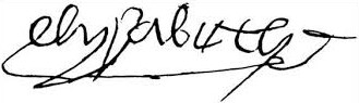
Elizabeth’s signature is interesting. There is a much reduced upper zone, suggesting she was not very intellectual. Even the ‘e’ is not capitalised reducing it to a middle zone letter, and see the ‘t’ and ‘b’ do not reach any further than the middle zone. So she has an over-emphasised middle zone. This shows a concern with everyday things, the here and now, including material possessions, nice clothes, jewels, outward appearance. She is emotionally focused on herself. However, she does also have quite a libido – see the phallic symbols? She crosses boundaries when it comes to sex and has strong sexual desires. And I don’t know about you, but when I look at that twiddly underline with the signature, it looks like a crown to me!
Finally let us consider the signature of George, Duke of Clarence. I have found one sample – unfortunately I do not know when it was written:
You can see that it is very angular and spiky. The sharp angles suggest anger or agitation. Perhaps this was written during the time when he was distressed about Isabel’s death and blaming the queen. It is quite legible, which shows that he was not deceptive – he may have changed sides a few times, but he didn’t keep it secret for long, he openly showed his hand. He could be a good communicator when he wanted to be. Like Elizabeth’s signature George’s middle zone is the most prominent and shows his preoccupation with himself and his immediate needs, his material possessions and outward show. He likes to be the centre of attention. There are no lower zone letters but the upper zone ones are quite well formed which suggests he was quite clever also. They tend to lean towards the right, which shows he lets his emotions show.
I hope you enjoyed this. Please give your comments or your own suggestions for interpretations below and I will do another post on some other WOTR characters in a while.

So much fun! Was Richard the only literate person in the family? Those other signatures are a mess!
LikeLiked by 1 person
True, especially Edward’s – completely illegible!
In fact, looking at some other contemporaries’ handwriting, it’s surprising how few of them are legible.
LikeLike
Indeed…like small children:)))
LikeLiked by 1 person
Or doctors.
LikeLiked by 1 person
I’m wondering if Richard had artistic talent. His calligraphy (when he wasn’t bent out of shape at the Duke of Buckingham) is so meticulous and beautiful.
LikeLiked by 1 person
Glad to have helped 🙂
LikeLiked by 1 person
Yes, thanks Ed – Ed was the one who deciphered the ‘cousin’ parts!
LikeLike
I hope you analyze Henry VII’s, I wonder what you’ll have to say about his huge, angular letters and the way they dwarf his wife’s signature where they both put their signatures on the same page.
His son Henry VIII also liked to write in huge letters, maybe it was a part of emphasizing royal authority. Speaking of which, Anne Boleyn’s signature is one of the few that really stand out among the signatures of people from the 15th and 16th century I’ve seen, by how perfectly legible it is. A sign of being a direct, ‘what you see is what you get’ kind of person?
LikeLiked by 1 person
Watch this space!
LikeLike
Also, it’s fun to see people of that period doodling images as part of their signatures; is this supposed to be a flower in the signature of John de Vere, Earl of Oxford? http://www.luminarium.org/encyclopedia/oxenford.gif
LikeLiked by 1 person
Reblogged this on Jo's Historic Collection.
LikeLike
I would love to see Richard, Duke of York’s signature. From what I can tell, Richard was like his father and I wonder whether this shows in his writing.
LikeLike
I haven’t seen one of his, but if you find one, let me know – I would be interested in the comparison too.
LikeLike